Sales Performance Analytics: A Power BI Dashboard for Revenue, Volume, Target Tracking, and What-If Analysis
Shows what sold. Explains why. Simulates what happens next.
Data Analyst
Description
Food makes up 91.39% of all revenue in this dataset; drinks make up the rest. That split alone doesn't say whether it's a healthy specialization or a business one bad season away from losing the majority of its revenue — that's a question that needs history, hierarchy, and scenario testing to answer, not a single pie chart.
A table of totals can show you the split. It can't show you which team is driving it, that Product 1968 alone accounts for 4.17% of all-time revenue, or what happens to the total if unit price moves. Answering those needs a model built to hold history, hierarchy, and scenario side by side — not a spreadsheet rebuilt every time someone asks a new question.
That's the model I built during DataSense Analytics' Power BI Masterclass, working from transaction-level sales for a fictional food-and-drink distributor selling through Retail, Distributor, and Online channels. Instead of burying calculations inside the fact table, I modeled a star schema — dates, products, categories, customers, and a sales hierarchy running Team through Manager, Supervisor, and Salesperson — with every DAX measure isolated in its own disconnected table: Revenue, Sales Volume, Average Transaction Price, Customer Coverage, Customer Buying Frequency, % of Target, each written once and reused everywhere a chart needed it.
Those measures are what power the what-if page, where the dashboard stops reporting and starts answering "what if": a Unit Price Scenario parameter lets you drag price up or down and watch a gauge chart recompute revenue against target in real time, no refresh, no rebuild. Below it, decomposition trees let you start at company-wide revenue and click down — team, manager, supervisor, salesperson, customer — until a single account is the reason a number moved.
The last page turns all of it into English: it names Product 1968 as the all-time top seller, shows Distributors leading on target attainment at 48.56% against Retail's 34.05% and Online's 17.39%, and turns each finding into a recommendation — instead of leaving the room to argue over what the chart meant.
Nobody has to guess anymore. The pie chart still shows food at 91.39% — but now it comes with the ranking, the reasoning, and a slider to test what happens next.
Highlights
- Star schema with dates, products, customers, and a sales hierarchy, plus a disconnected Measure table holding every DAX calculation
- What-if parameter recomputes a target gauge live as unit price changes, with no data refresh
- Decomposition trees drill from company-wide revenue down to a single customer through Team → Manager → Supervisor → Salesperson
- Written insight page turns product, category, and target-attainment findings into plain-language recommendations for where to focus next
Screens
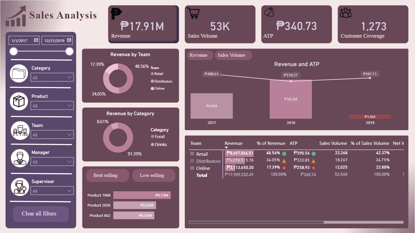
Screenshot 1 of 7: Sales Analysis page showing revenue by team, category, and top-selling products
Revenue overview: by team, by category, and by product, with a three-year trend.